If We Could Choose the Color of the Year...

Check Out The Colors Our Designers Chose To Represent 2021

RAY'S PICK

Pantone 11-4001

2020 was a year that impacted every one of our lives. Through it all we were able to do our best and close that chapter. Now, 2021 is not only a new year but a new beginning. Pantone 11-4001 represents this. This is a fresh start or a blank slate for everyone to move forward. This color represents optimism, hope, clarity and the ability to refine, which are things we all need and can accomplish this year and the entire decade to come.


DEVON'S PICK

Pantone 1058

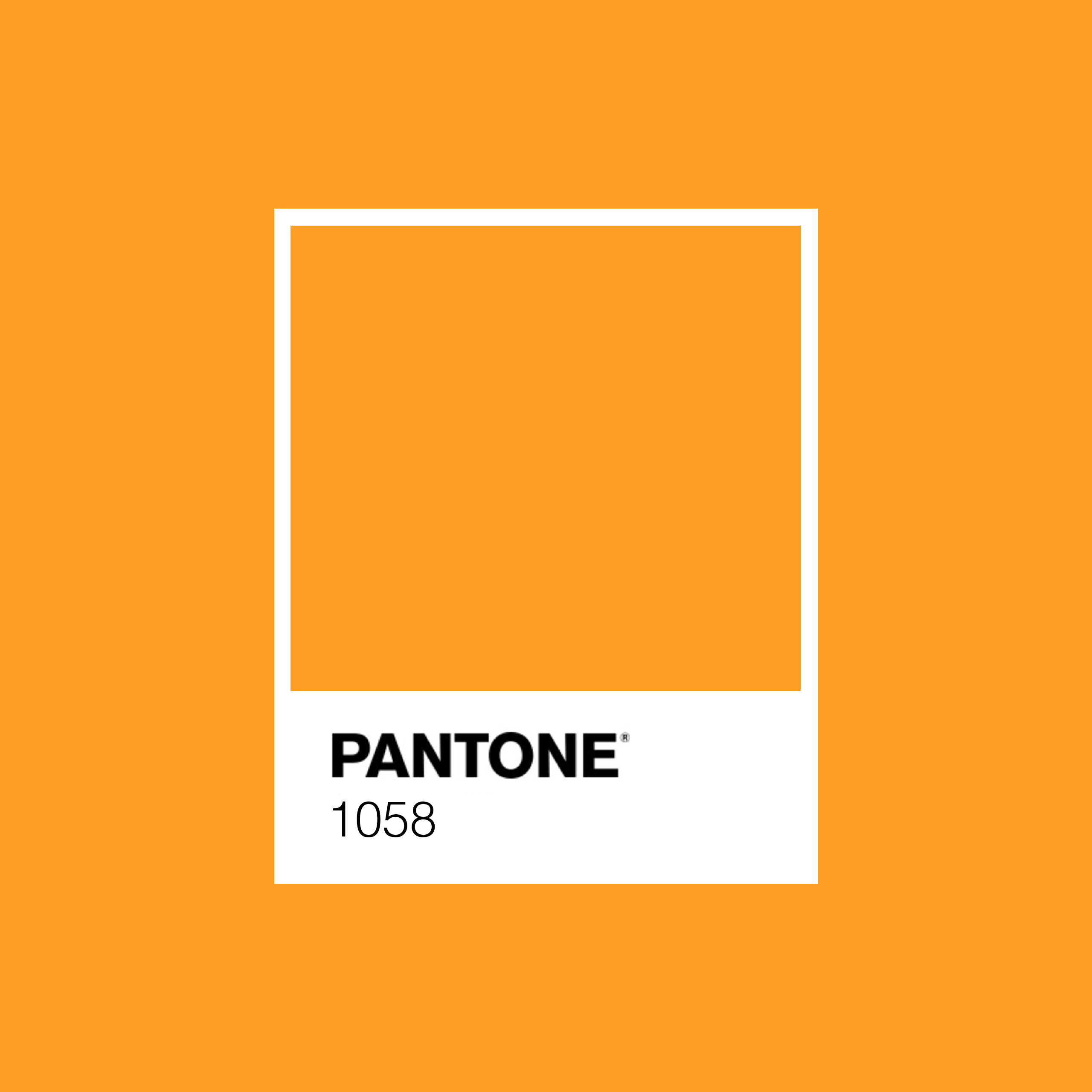
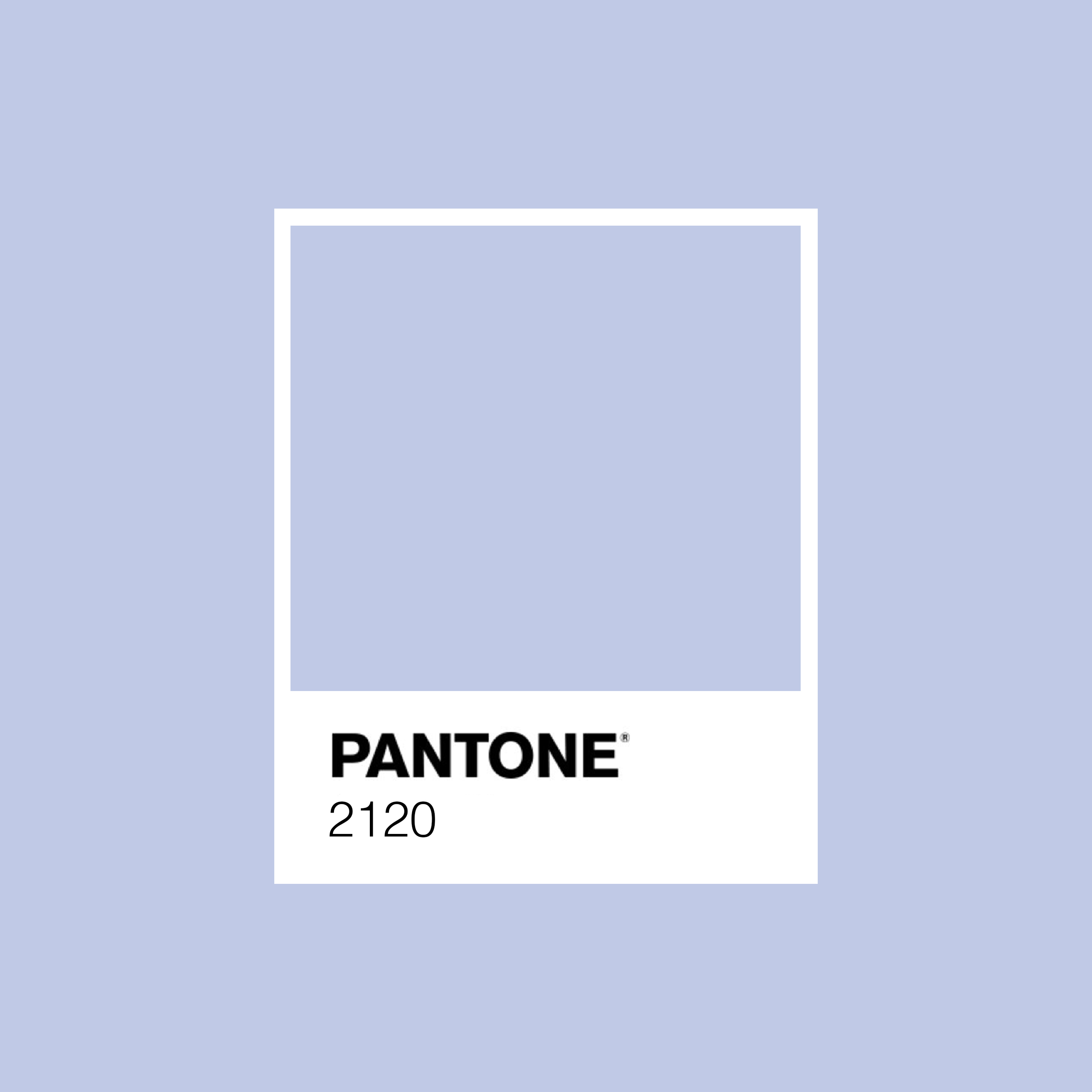
This nice bright orange serves as a warning for 2021 to be on its best behavior! I like that the color is "poppy" without hurting my retinas; it's not too red or too yellow, just the perfect shade of orange. I also think it naturally would be used hand-in-hand with other cheerful colors like bold blues, greens, pinks, yellows... all of which could inspire happiness throughout our daily lives. I liked where Pantone was going with the Yellow, but why oh why would you pair it with Gray? After such a terrible year, I want to feel positive and uplifted!


NIKKI'S PICK

Pantone 2120

The calm, cool tone of this periwinkle purple creates a sense of peace, relaxation & reflection. With the stresses and challenges of 2020 behind us, this color can serve as a reminder to move forward in 2021 with a calm approach and positive mindset; a focus on gratitude and an emphasis on wellness. This color would pair nicely with natural earth tones, creating the perfect palette for a zen home atmosphere.


The Designers

Ray Fuentes Jr
Devon Nittoli
Nikki Trusa